Mock ups for one possible poster design. Trying to show ARness, Kaiju Kazoo style, and a bit of crazy Japanese kaiju movie poster (very busy, lots of stuff going on, pulling elements from Joe's earlier mockup). These are smaller and use ingame assets, so a final poster would be a lot more polished. Supposed to be like a refrigerator in the background.
Thursday, November 1, 2012
Saturday, October 6, 2012
Fireball!
Took a bit longer than expected, but decided to restart and hammer out the reentry fire effect today and got 4 decent frames of two tone anime looking fire. Our animation style is a bit intentionally choppy at the moment and it'll be moving, so 4 frames may be enough. Now that I have the style, hopefully the impact will go quicker. At the bottom of the to do list, I might revisit the explosions with this style.
Tuesday, October 2, 2012
Wednesday, September 26, 2012
Menu/Tutorial/Intro
Horrible lighting in my basement.
Here is a video of the Menu/Tutorial/Introduction stuff I've spent the few weeks working on:
Here is a video of the Menu/Tutorial/Introduction stuff I've spent the few weeks working on:
Lemme know what you think.
Monday, September 24, 2012
Difficulty Curve and Pacing
The reason behind the first image has a lot to do with the wave pacing, but it also has to do with all the other things we're working on, such as enemies, health, etc.
Thoughts?
Streamlined Health UI - Super Gamera Attack
Here is an idea David, Logan and I had during the playtest today (as a team we've kicked very similar ideas around before). It is supposed to make the health UI more readable. The change would also make the game a little harder because you can only get hit twice before you die (right now you die after getting hit three times when you have max health). Instead of a third health state, we could have a super attack. If the player is at max health and if they collect enough buildings, then the shell in the corner turns purple. Once it turns purple, the next time the player taps anywhere on screen, the Kaiju rampages super gamera attacks (looping around the entire kazoo in half a second).
What do you guys think?
Thursday, September 20, 2012
Uni the Shell
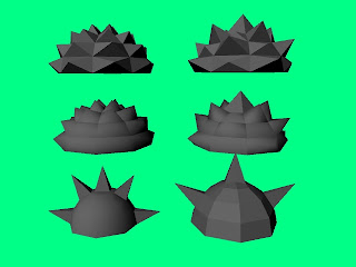
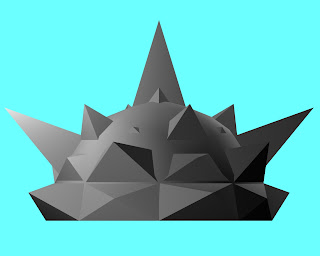
We are talking about creating a new enemy and some thought has going towards an 'urchin' style tank. Here are some early stabs at the new type.
Underneath the shell there will be some retractable tank treads to provide the illusion of mobility. Although if push comes to shove the treads can be done away with and a simple dust particle effect, like the one we've been using, would be acceptable.
 |
| This is just a collection of different looks for the tank's shell. |
 |
| Here is a nice combo of two shell types mashed together. |
Quick art dump.
 |
| A floating sci-fi styled billboard that would hover around in empty space. In the middle section would be an animated gif. |
 |
| A simple billboard that would be attached to the side of a building. Animated gif goes in the black area just like the sci-fi billboard. |
 |
| A rocket with a currently undetermined game mechanic, but nonetheless, another object for the Kaiju to destroy. |
Tuesday, September 18, 2012
Tuesday, September 11, 2012
Subscribe to:
Comments (Atom)


